
The First Impression Nobody Talks About
A donor rarely announces that they are evaluating your brand. They do not open a tab and think, “Now I will assess this nonprofit’s credibility, clarity, and long-term vision.” What they actually do is click a “Donate” button and land somewhere that either feels trustworthy or slightly off. That moment carries more weight than most organizations are willing to admit.
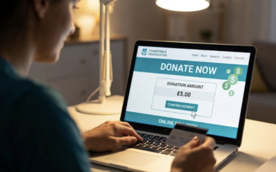
Your donation page is not a backend utility. It is not just a checkout screen. It is one of the most emotionally charged touchpoints your organization has, because it sits right at the intersection of intent and action. Someone has already decided they care. Now they are deciding if they trust you enough to follow through.
The subtle part is that this decision happens quickly. Layout, load speed, copy tone, payment options, even the spacing between elements all contribute to a gut-level reaction. You do not get a second chance at that moment. If the experience feels clunky, outdated, or confusing, the donor does not write you a polite email explaining why they left. They just leave.
Design Choices Carry Meaning
Every visual and structural decision on your donation page communicates something about your organization, whether you intended it or not. A cramped form with tiny text and unclear labels signals a lack of care. A clean, well-paced layout with thoughtful copy suggests professionalism and intention.
This is where many nonprofits underestimate the impact of design. They assume branding lives on the homepage, in campaign materials, or in storytelling content. Meanwhile, the donation page quietly reinforces or undermines everything else.
Think about the difference between walking into a well-lit, organized store and stepping into one where items are scattered and signage is confusing. Both might sell the same products. One feels reliable. The other feels like a gamble. Your donation page creates that same kind of environment, just digitally.
Trust Is Built In Micro-Moments
Trust is not a single element you can add to a page. It is the accumulation of small signals that, together, make someone feel safe completing a transaction.
Clear language matters. If your form labels are vague or inconsistent, people hesitate. Transparent pricing or suggested amounts matter. If donors feel like they are being nudged without understanding why, they pull back. Even confirmation messages matter. A thoughtful, immediate acknowledgment reinforces that their action was received and valued.
The interesting part is how sensitive people are to friction in this context. Someone might tolerate a slow-loading blog post or a slightly awkward navigation menu. When money is involved, patience drops dramatically. A delay of a few seconds or a confusing step can break the entire experience.
The Emotional Context Is Everything
People do not arrive at your donation page in a neutral state. They come with a mix of motivation, curiosity, and sometimes urgency. Maybe they just read a story that moved them. Maybe they saw a social post that resonated. Maybe they were referred by a friend.
Your donation page needs to meet them in that moment, not reset the experience. If the page feels disconnected from the message that brought them there, it creates friction. The emotional thread breaks.
This is why consistency between campaigns and donation flows matters more than most teams realize. The tone, visuals, and messaging should feel like a continuation, not a pivot. When that continuity is strong, the act of giving feels natural. When it is weak, the donor has to reorient themselves, and that is where hesitation creeps in.
Speed Is Part Of Your Brand
Performance is often framed as a technical concern, but donors experience it as part of your brand. A fast, responsive donation page feels modern and reliable. A slow one feels outdated, even if the rest of your organization is doing incredible work.
This is not about shaving milliseconds for the sake of optimization metrics. It is about respecting the donor’s time and attention. When someone clicks “Donate,” they are ready to act. If the page lags, that readiness fades.
Mobile performance is especially important here. A growing number of donors interact with organizations through their phones, often in moments that are not ideal for complex interactions. They might be on a couch, in a car, or waiting in line somewhere. Your donation flow needs to work seamlessly in those contexts, not just on a desktop during a calm, focused session.
Clarity Beats Creativity
There is a temptation to make donation pages feel unique or clever. Creative layouts, unconventional navigation, or playful copy can work in other parts of your site. On a donation page, clarity almost always wins.
People want to understand what they are doing, how much they are giving, and what happens next. If they have to think too hard about any of those steps, the experience starts to feel risky.
This does not mean your page should be bland. It means your creativity should support clarity, not compete with it. A strong headline, a clear impact statement, and intuitive form fields do more for conversion and brand perception than any experimental design choice.
Payment Experience Shapes Perception
The moment someone enters their payment information is one of the most sensitive parts of the entire journey. It is where trust either solidifies or cracks.
Offering familiar, secure payment options can make a significant difference. People are more comfortable when they recognize the methods available to them, whether that is credit cards, digital wallets, or other widely used options. If your payment experience feels limited or unfamiliar, it raises questions.
Security signals also play a role. Visible indicators that the transaction is protected, along with a clean and professional interface, help reinforce confidence. These are not just technical details. They are part of the story your brand is telling about reliability and care.
Recurring Giving Reflects Commitment
How you present recurring giving says a lot about how you view donor relationships. If it is buried or treated as an afterthought, it feels optional in a way that diminishes its importance. If it is integrated thoughtfully, it communicates that you value long-term support.
The way recurring options are explained matters. People want to know what they are signing up for, how they can manage it, and what impact their ongoing support will have. When that information is clear and accessible, recurring giving feels like a partnership rather than a commitment that might be difficult to adjust later.
This is one of those areas where design, copy, and backend functionality all intersect. A smooth experience reinforces trust. A clunky one creates hesitation that can extend beyond the initial transaction.
Your Follow-Up Is Still Part Of The Page
The donation experience does not end when someone clicks “Submit.” The confirmation screen, receipt email, and any immediate follow-up are all part of the same journey.
A generic confirmation message feels transactional. A thoughtful one, even if it is simple, reinforces the donor’s decision. It acknowledges their action in a way that feels human rather than automated.
Email receipts are another touchpoint that often gets overlooked. They are functional, yes, but they are also an opportunity to reinforce your brand voice and provide clarity about what happens next. When these elements are aligned with the rest of your experience, they create a sense of continuity.
Internal Alignment Shows Up Externally
One of the reasons donation pages feel disjointed is that they are often owned by multiple teams with different priorities. Marketing focuses on messaging, development focuses on functionality, and operations focuses on data. Without alignment, the result can feel fragmented.
When teams are aligned, the donation page reflects that cohesion. Messaging flows naturally into the form. Data collection feels purposeful rather than excessive. The overall experience feels intentional.
This kind of alignment does not happen by accident. It requires clear communication about what the donation page is supposed to achieve, not just in terms of revenue but in terms of brand experience.
What Donors Remember
Most donors will not remember the exact wording of your headlines or the specific layout of your form. They will remember how the experience felt.
Did it feel easy or frustrating? Did it feel trustworthy or uncertain? Did it feel like their contribution mattered or like they were just another transaction?
These impressions shape future behavior. A positive experience makes it more likely that someone will give again or recommend your organization to others. A negative one does the opposite, often quietly and without feedback.
Building A Donation Page That Represents You Well
Creating a donation page that truly reflects your brand is not about adding more features or chasing trends. It is about making intentional decisions that align with how you want to be perceived.
Start by looking at your current experience from a donor’s perspective. Walk through it on different devices. Pay attention to where you hesitate or feel unsure. Those moments are signals.
Then consider how your page fits into your broader brand. Does it feel consistent with your messaging and visual identity? Does it support the emotional context of your campaigns? Does it make the act of giving feel straightforward and meaningful?
These questions do not have quick, one-size-fits-all answers. They require thoughtful evaluation and, often, iteration. The organizations that invest in this process tend to see their donation pages not just as tools, but as extensions of their identity.
Where This Quietly Pays Off
Over time, the impact of a well-designed donation page compounds. Conversion rates improve, even if only slightly at first. Donor trust strengthens. Recurring giving becomes more stable. Internal teams spend less time troubleshooting and more time improving.
None of this feels dramatic in the moment. It feels like small improvements, gradual refinements, and ongoing adjustments. Yet those incremental gains add up.
Your donation page is not just where transactions happen. It is where your brand is experienced in one of its most important moments. Treating it with that level of care changes how people see you, and more importantly, how they choose to support you.


0 Comments